
We were asked to create a website based on a collection that we have or something that we are interested in (sort of like an online fanzine - hence the v clever name).
I'm one of those people who likes having a nose through other people's things, getting recommendations from other people based on what they use and I am also a v big fan of stationery. So I decided to base my project around that - A sort of What's In My Handbag kinda thang.
It eventually turned into a website that creative people could use to find out about other artists through the tools that they use in their work.
I'll just pop up some screens now and try to explain my ideas.


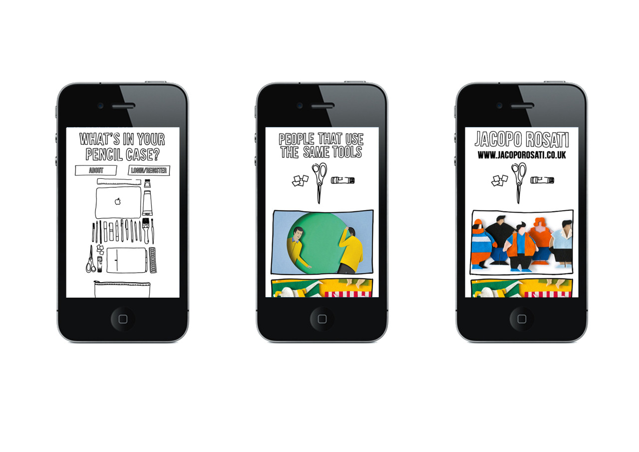
This is the home page, the website had to work across different platforms (more on that later) so I wanted it to be simple and pretty self explanatory. When a user arrives on the homepage they are asked "What's In Your Pencil Case?" and invited to drag the items that they like to use into their pencil case.

After choosing their items, they are taken to a screen that shows them a selection of artists that use the same tools that they have chosen.
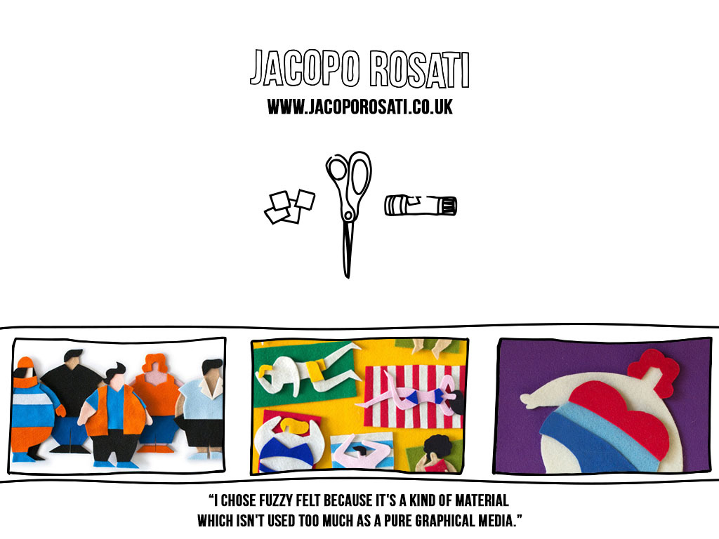
After clicking on an image that they might like the look of they are taken to a sort of profile page with a larger selection of their work and a link to their website. This page is for Jacopo Rosati, his work is really cool, he uses fuzzy felt as his main material for collages.

There's also a little page with some information about the website and the login/register button offers users the chance to login and save searches, useful for inspiration for a project where they were working with certain materials maybe?
I wanted the aesthetic of the screenzine to be a bit wobbly and hand drawn but I wanted the overall look to be relatively simple, so as not to distract from the artists' work.


I originally used a blue background with white line but my tutor advised that those colours would probably hurt peoples' eyes if they were using the site for a long time.
As mentioned before the website had to work across different platforms which meant a bit of rejigging of the layout so it could be used on mobile devices.

There'd be a bit more scrolling involved if you were on a phone once you got past the home page but I don't think thats a massive problem. Scrolling is fun on an iPhone.
Overall I'm really pleased with this project, as always it could do with a few changes here and there but its probably my most successful project of the term.
(That was a long post, sorry)
No comments:
Post a Comment